Community Suggestion: Re-design the Worldanvil community interaction section(s)
Re-design the Worldanvil community interaction section(s)
User Interface (UI) / User Experience (UX) · Articles & templates · Created by Bladeswillfall
accepted
community article layout ui ux css tweaks redesign design update
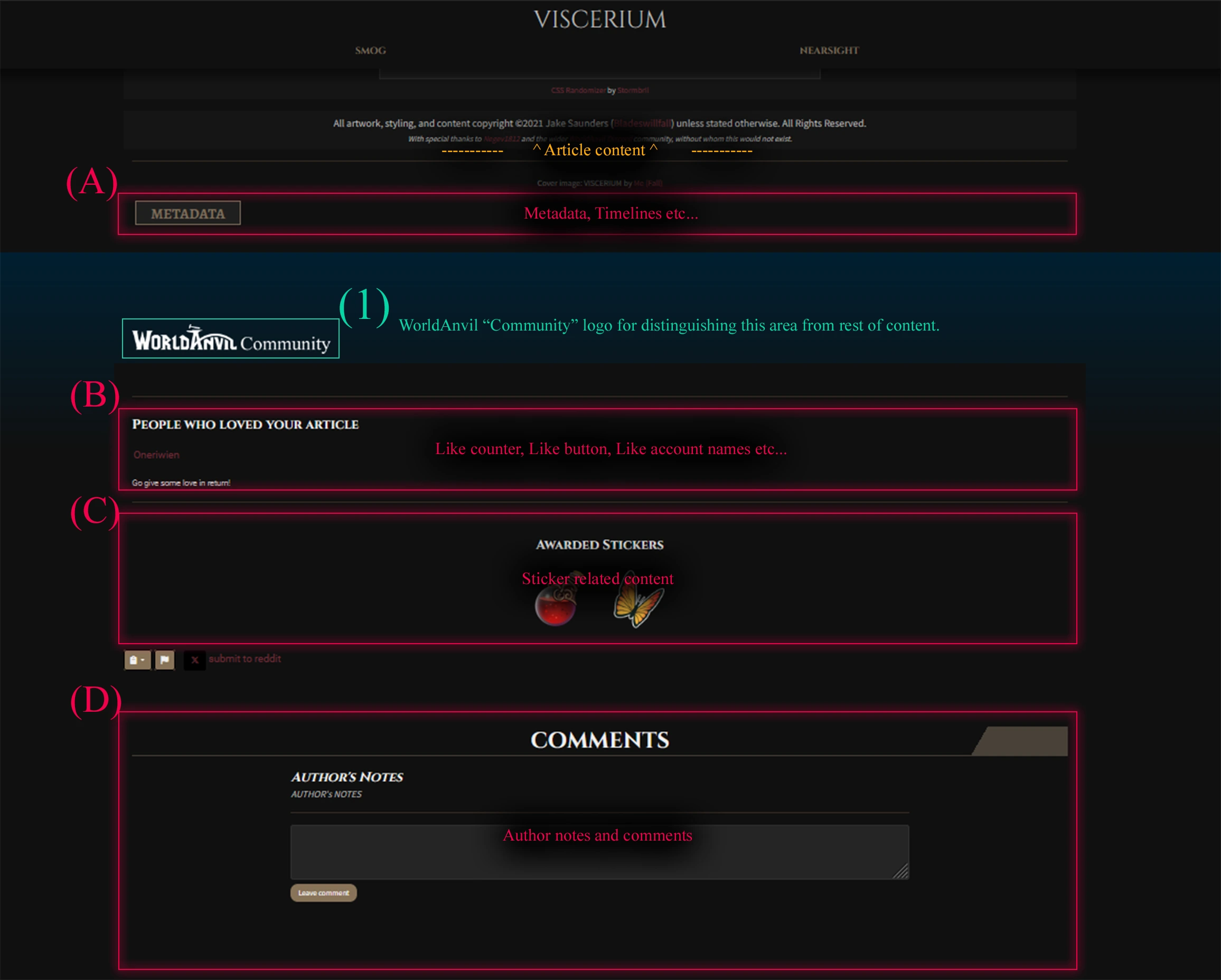
What functionality is missing? What is unsatisfying with the current situation?
I really quite dislike that there is no distinction between what is my content/creation versus what is community driven/interaction based. I'd love to move all of that content into its own section just below the metadata/timelines and give it its own optional styling to showcase the difference between what is part of the article, and what is part of the WA community.
How does this feature request address the current situation?
Currently, there is no way to effectively re-order this content as it is all under different parent elements. I, with the help of Oneriwien, have been able to create this mockup on WA usingly only CSS, but it is not responsive and is forced to use absolute positioning and pixel values. My suggestion is to move all of this content into the .page-extended group and structure the content in a more logical/easily modifiable way.What are other uses for this feature request?
I love the WA community and want to showcase their contributions/discussions, without interfering with my worlds theme/tone. In theory, this would help to highlight that the world is hosted on WA and for folks viewing articles without a login, give them a clear sign-post for what they need to do to interact with the article (create an account/login). That's why I think it's important to add the WorldAnvil Community logo, or something similar to this section. For articles with community interactions disabled, this whole section could be hidden in a neater way.The Team's Response
Thanks for the suggestion! It's a good idea, but given that only 26 people have supported this and it would visibly affect every single article on World Anvil (as well as all CSS themes), we will not go forward with this now. Instead, when we develop the new version of presentation mode, we'll bundle this in.
Current score
26/300 Votes · +7100 points
Votes Cast
-
+300
by A Roaring Ooze
on 2025-05-08 08:02 -
+100
by LotusSeer
on 2025-05-07 22:12 -
+300
by Tillerz
on 2025-05-04 20:16 -
+100
by nnie
on 2025-05-01 12:10 -
+300
by Naelin
on 2025-04-29 16:02I love the idea of putting the stickers under .page-extended For the likes I don't mind either way, but I agree it's more consistent if all of the community stuff is in the same place, though I would prefer for it to have its own CSS section so it messes up less with the comments css
-
+300
by shadowclasper
on 2025-04-26 22:39 -
+300
by JoellaKay
on 2025-04-26 00:48 -
+100
by The Empathist
on 2025-04-25 21:04 -
+300
by Kittymonster
on 2025-04-25 15:00I would really like all community features (social media shares, WA buttons, stickers, comments etc) separated from the article section and grouped together in a dedicated section. Another way to show logged out readers that they can take part is to add a "log in to comment" button (or change the leave comment button to do that). Clicking it redirects them to create an account / log in, and then redirects them back to the article.
-
+300
by Mochimanoban
on 2025-04-25 14:02 -
+300
by HunterChristmas1247
on 2025-04-25 13:41 -
+100
by LittleRaider
on 2025-04-24 17:37 -
+300
by Those2Nerds
on 2025-04-24 17:26 -
+300
by Evanarix
on 2025-04-24 01:44 -
+300
by DaniAdventures
on 2025-04-23 19:15 -
+300
by Vazdimet
on 2025-04-23 18:30 -
+300
by Sh4d0wPh03n1x
on 2025-04-23 18:24 -
+300
by DMFW
on 2025-04-23 18:20I like the social features, but also would like to see them grouped together at the bottom of the author designed features of the page.
-
+300
-
+300
by AmélieIS
on 2025-04-23 18:00 -
+300
by tjtrewin
on 2025-04-23 17:54 -
+300
by Hephaestus
on 2025-04-23 17:54 -
+300
by Oneriwien
on 2025-04-23 17:40Part of WorldAnvil's social aspect, specificaly stickers and comments with signitures, can absolutely destroy any theming aspect you are trying to maintain. THis is mostly apparent on darker world themes. Having this change would be FANTASTIC for myself and a few clients I have worked with that have asked me the best way to get handle the stickers. I understand they are a feature a lot of people love, but I would really like if they were not trapped on your article and were instead near the comments like shown above. My personal order would be: B A C D as I'd like the likes closer to the top.
-
+300
by kaixabu
on 2025-04-23 12:19I wish I could move Gallery up above the footer/comment/etc. Seems out of place after all a footer, but even this above would be great!
-
+300
by Daedalus_Arts
on 2025-04-23 06:48 -
+100
by GMSeth
on 2025-04-22 23:01 -
+300
by Bladeswillfall
on 2025-04-22 17:57
Find your way!
Resources
WHO WE ARE
LEGAL
Listen to our Podcast




by 3 Armored Kittens · Prodromos v.1.1 - World Anvil 0.9.15.050 © 2017-2025 [en] | Anvil Time: 00:14, Oct 13 2026